The Vera Project
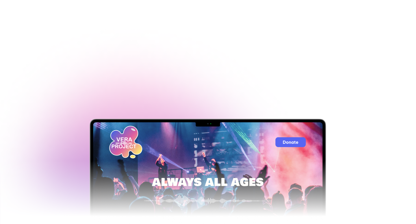
A non-profit organization based in Seattle that promotes personal and community growth through collaborative youth engagement in music and art. The Vera Project hosts a variety of events such as music concerts and art exhibits that provide opportunities for community members of all ages to get involved in creative arts.
The Vera Project, a Seattle-based non-profit organization, is dedicated to enhancing the community through the power of music and art. Their commitment to arts education and organizing music events bring people together and empower young individuals.
Throughout this project, my goal was to elevate the visual communication design of The Vera Project. Over a span of 10 weeks, I analyzed, iterated, and reimagined the potential appearance of The Vera Project. I gained valuable insights into brand and marketing, design, and upon completion the overall customer experience of The Vera Project.
Overview
My role
Product Designer
Duration
March - May 2023
Class
HCDE 308 (Visual Communication In Human Centered Design And Engineering)
Research 🧐
Brand’s Values
Education: Vera promotes personal growth through experimental learning– hosting workshops and classes aimed at educating people of all ages on different aspects of music and art.
Leadership: Vera empowers growth through mentorship programs and opportunities for individuals to organize grassroots social movements.
Advocacy: Vera advocates for access to art to be accessible to everyone. Vera strives to provide a space for individuals to express themselves by providing safe and inclusive spaces for people to share their work and tell their stories.
Community: Vera promotes inclusivity by building a sense of community. Developing community-centered events provides a platform for meaningful human connections to form and establishes a strong support system that enables individuals to thrive.

Audiences 👱♂️👩🦰🧑🦳🧑🦱
While the Vera Project is open to all ages, it primarily consists of volunteers between the ages of 12-24. The Vera Project focuses on building local communities– so it is local-specific. Therefore, the ideal audience for Vera would be young adults between the ages of 12 and 24 residing in the greater Seattle area.
How does the organization communicate with audiences?
Events and Concerts- host events and concerts featuring local and touring artists.
Volunteer Opportunities- offers a wide range of volunteer opportunities for volunteers to get involved with community events.
Workshops and Classes- offers a variety of workshops and classes covering topics such as music production, photography, and DIY screen printing.
Social Media- maintains an active presence on social media platforms such as Twitter, Instagram, and Facebook.
The Challenge
CONTENT OVERLOAD
The website suffers from an overwhelming amount of content, starting from the homepage. CTA links are scattered without a clear hierarchy, making it challenging for users to navigate.
NAVIGATION CONFUSION
Information Architecture is complex, with lower hierarchy elements often appearing alongside top hierarchy ones. Poor categorization of the website's content causes confusion among users.
LACKLUSTER BRANDING
The Vera Project's various services are not immediately apparent upon visiting the website. Users must dig deeper to find relevant information, leading to a weak initial impression.
Design Goal 🎯
The design goal for this project is to create a branding for the New VERA Project that exudes a specific feel. The branding should evoke a sense of creativity, inclusivity, and youthful energy, while also reflecting the organization's dedication to community engagement and artistic empowerment.
Identify User’s Need
The New Vera Project ✨
Following a thorough analysis of the brand, my objective was to ensure that VERA's new branding captured the essence of creativity, inclusivity, and youthful energy. Simultaneously, it needed to embody the organization's commitment to community engagement and artistic empowerment.
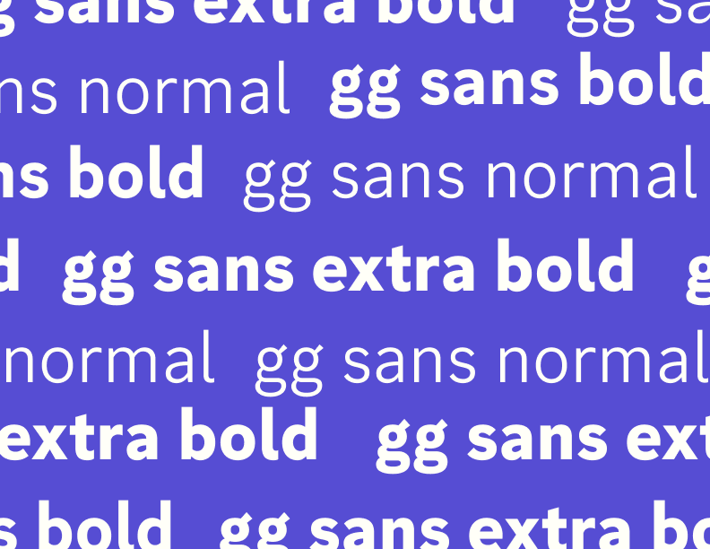
With these three key themes at the forefront, I embarked on defining Vera’s new visual elements, including typography, color schemes, and logos, to create a cohesive and impactful brand identity.
Visual Design 🌟
Logo Design
My logo combines the elements of paint/color drops with the pulsating rhythm of music beats to symbolize the harmonious blend of art and music within the vibrant community. The paint/color drops represent the creativity and diversity of artistic expression, while the music beats symbolize the rhythm and energy that music brings to our community. Together, they embody our commitment to promoting and nurturing a thriving art and music community, where individuals can come together to explore, create, and inspire. Through this logo, I aim to visually convey the synergy between art and music, inviting everyone to be a part of a dynamic and inclusive creative movement.
Final Logos
Logo in black&white
Logo in colors
Mood Board
Brand colors
To promote a sense of fun and creativity, I have chosen blue and pink as the primary and secondary colors in the branding. Blue represents a sense of calmness, reliability, and trust, while pink symbolizes creativity, playfulness, and individuality. These colors work together to create a vibrant and engaging visual experience that captures the essence of the brand.
In addition to blue and pink, I have incorporated red and yellow as supporting colors. Red adds a touch of excitement, passion, and energy to the visual identity, while yellow brings warmth, optimism, and a sense of joy. These supporting colors enhance the overall vibrancy and dynamism of the brand.
By utilizing this color palette, I aim to evoke positive emotions and inspire a sense of adventure, imagination, and self-expression in the audience.
Typography
Marketing 📣
Marketing templates
In the social media marketing strategy, I prioritize consistency by using brand colors in each post. This ensures that our audience can easily recognize and associate our content with the brand.
When it comes to illustrations, I opt for a black background to provide a striking contrast and make the illustrations pop. By incorporating gradient elements into the illustrations, I add depth and visual interest, capturing viewers' attention and making the artwork visually engaging.
For photographs, I select images with darker backgrounds to maintain consistency with the illustration pages. This approach helps to create a cohesive visual aesthetic across social media feeds, enhancing the overall brand experience for audiences.
In crafting short quotes, I employ a gradient of pink or red, which adds a touch of vibrancy and passion to the text. This gradient effect draws attention to the quote, making it stand out and encouraging interaction from our followers.
For longer quotes, I utilize a gradient of blue or purple. This choice brings a sense of calmness and depth, complementing the lengthier text and ensuring readability while still maintaining the visual appeal.
By following these guidelines, I create a visually cohesive and engaging social media presence that aligns with the brand's identity and captures the attention of target audiences.
Instagram Campaign
Poster Design
To promote a sense of fun and liveliness, I incorporated music wave graphics and employing bold text. I aim to create a dynamic and engaging atmosphere that resonates with audiences.
In addition to music waves, I carefully selected illustrations that align with the specific event or class I’m promoting. These illustrations not only capture the essence of the occasion but also add visual appeal and coherence to the overall branding.
To ensure maximum impact, I use a contrasting approach of white text on a black background. This high contrast creates a striking visual effect, making the text stand out and grab the viewer's attention. This technique enhances readability and ensures that the message is clear and easily digestible.
Merchandise
Mobile interface 📱
Takeaways 🤘
Lack of communication between organizations and users leads to confusing designs and reduced sales. Initially, I relied heavily on visuals, removing descriptive words. However, testing revealed that users struggled to understand images alone, and icons and pictures were not effective channels of communication. Adding words and descriptions overall reduced the chances of errors and improved clarity.
Balancing stakeholder goals, target audience, and visual aesthetics was a major challenge, but I strived to create a design that appeals to all. Given more time, I would have focused on improving mobile responsiveness, an area where the current website falls short.
Unexpectedly, maintaining consistency with the designed brand proved challenging due to constant iterations. It was easy to lose track of the latest branding decisions. However, these iterations were crucial in reaching the final product, especially regarding elements like logo design.
Time constraints limited the number of iterations for my mid to high-fidelity mobile designs. With additional time, I would have explored and refined the mobile design further, conducting more usability testing. Despite this limitation, I am pleased with the result of creating a brand book, which proved to be a rewarding challenge.


